
What's on the Inflation Horizon?

The title of this blog is, without a doubt, what investors are quite eager to find out. Two weeks ago the markets received the July data for both the Consumer Price Index (CPI) as well as the Producer Price Index (PPI). The lion’s share of the headlines tends to go to the CPI, but this report is like looking in the rearview mirror, to coin a phrase. In order to see where the road to inflation may be headed, the PPI figures may provide better insights.
After posting outsized gains in the prior four months, the July CPI increase was pegged at a more moderate 0.5% on a monthly basis. However, the year-over-year rate remained unchanged at its elevated 5.4% reading. Nevertheless, some market participants were quick to point out that the recent string of year-over-year gains had not continued.
Figure 1: U.S. Final Demand & CPI
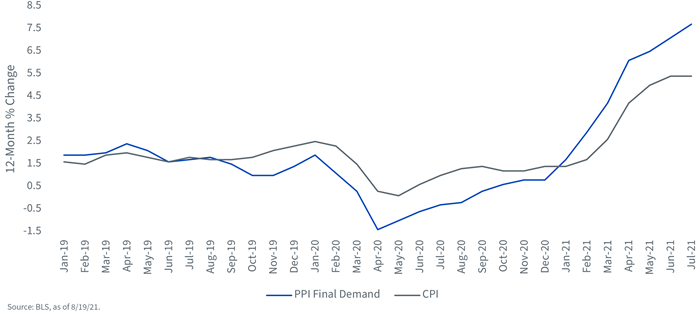
This is where the PPI data comes into view. But before I get into that discussion, first some Inflation 101. The PPI report represents price trends at the wholesale level while CPI data represents retail prices. So, in theory, one could make the case that the trend in place for wholesale prices could logically work its way through to the retail level. For the record, it’s not always a clean pass-through, but as you can see from the graph (Figure 1), the trendlines have seemed to fit for the most part over the last few years.
Back then to PPI, where the Bureau of Labor Statistics (BLS) reported that the 12-month increase for the final demand index rose 0.5 percentage points to 7.8%, the largest advance since this data was first calculated in November 2010. Is this a harbinger of what’s to come? At a minimum, it certainly represents a challenge to the ‘inflation is transitory’ case.
You know another trend that bears watching? Wage increases. The graph below underscores how the year-over-year increase for average hourly earnings has been on a roller-coaster ride over the last 12 to 18 months. Prior to the COVID pandemic, the 12-month gain for wages had been rather range-bound around the 3.0% to 3.5% band. Once the economy locked down after February of last year, the increase spiked to as high as 8.2% in April. With low-wage earners being hit disproportionately harder by the lockdown and becoming unemployed, the labor market data was left primarily with the higher-wage worker component. Thus, the spike. As you can see, as the labor market began to normalize, the trend began to reverse, and when the lower-wage worker returned, the 12-month gain actually sank to a low of 0.3% in April of this year.
Figure 2: Average Hourly Earnings
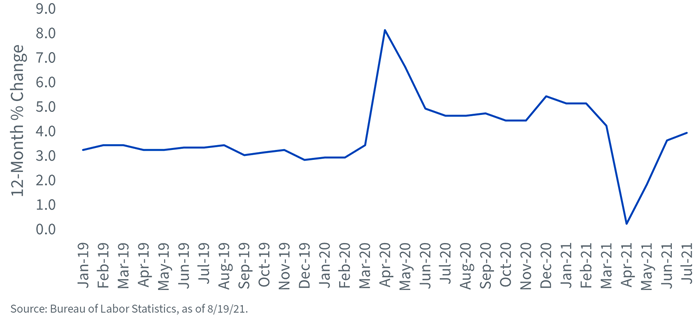
Now, with a ‘fairer’ representation among those who are employed, one can draw an interesting conclusion; namely, wage gains appear to be gaining traction even with the inclusion of the low-wage earner. In fact, the 12-month increase for July was pegged at 4.0%.
The bottom line message is that if the rising trend in wholesale prices get passed through to households and wage trends become visibly elevated, it is difficult to envision inflation coming back down toward the Fed’s 2% target any time soon, and perhaps, in the foreseeable future.
Share & Comment
Popular Posts
Categories
Related Links